A considered guide to the bedroom
How to Choose Bovi Bedding by Design, Detail, and Room Style
The right bedding does more than complete a bed. It sets the tone of the room, changes how color and light read, and brings a tactile point of view to the spaces we return to every day. When comparing Bovi bedding, start with the whole composition: palette, pattern, finish, and the details that will remain visible once the bed is made.
Published October 18, 2026
At first glance, choosing bedding can seem like a question of color. White, ivory, blue, a print that catches the eye: the decision appears simple until the choices meet the room. A shade that looks crisp on a screen may feel cool beside warm wood. A decorative border can be quietly elegant when folded back, yet visually busy against an already patterned headboard. Texture, too, has its own presence. Smooth sateen reflects light; a more matte surface can soften a room’s atmosphere.
That is why a thoughtful search for Bovi bedding benefits from looking beyond the first impression. Consider how a design works with the room’s existing materials, how much ornament feels right, and whether the construction and care suit everyday use. The aim is not to follow a rigid decorating formula. It is to make a choice that feels intentional from across the room and rewarding at close range.
This guide offers a practical way to assess bedding design, compare visual details, and build a cohesive bedroom palette. Since product names and collections can vary, treat each item’s current description, specifications, and care instructions as the final reference when shopping.
Begin with the room, not the product page
Before comparing patterns, take a quiet inventory of the bedroom. Note the colors that are already fixed: wall paint, flooring, furniture, curtains, rugs, and the headboard. These elements form the setting for the bedding. A useful approach is to identify the room’s dominant temperature and contrast. Does it lean warm, with honeyed timber, cream walls, and brass? Is it cooler, with pale gray, black accents, or blue-toned light? Or does it combine both?
Then consider how much visual activity the room already contains. A carved bed frame, expressive wallpaper, or boldly patterned rug may call for bedding with a calmer surface. In a spare room with plain walls and simple furniture, bedding can take a more pronounced role. This is less a rule than a matter of balance: the eye needs places to rest as well as details to discover.
- Identify the room’s anchor colors. These may be the wall color, the headboard, or a large rug rather than the smallest decorative accessory.
- Notice the materials. Wood grain, metal finishes, painted surfaces, and woven textiles all affect how a bedding color appears.
- Assess existing pattern. Count the main patterns already in view, and decide whether the bed should echo them or provide contrast.
- Think about daylight. A bedroom that receives warm afternoon sun can make cream and beige appear richer; a shaded room may make those same colors read cooler.
This first edit makes comparison easier. Instead of asking whether a design is attractive in isolation, ask what it will contribute to the room. Will it introduce softness, sharpen the palette, or lend the bed a more tailored finish?
Read the palette in layers
Color is rarely a single note in a finished bedroom. Sheets, duvet cover, shams, blanket, and accent cushions may each occupy a different part of the palette. The most composed arrangements tend to use a small family of related shades rather than a collection of competing favorites. That family could be tonal—several variations of ivory and sand—or built around a grounded neutral with one measured accent.
When comparing Bovi bedding colors, distinguish between the main field and the smaller details. A border or piped edge may introduce a second color in a restrained way. A printed motif can bring several shades together, but it may also make coordination with existing accessories more demanding. Ask whether the secondary colors are already present in the room, or whether they would require a broader refresh.
White and ivory are often described as easy choices, but they have character of their own. Bright white can feel crisp and graphic, particularly with dark furniture or black accents. Ivory is softer and can sit comfortably beside warm woods and aged brass. Neither is universally more versatile; the room’s undertones determine which feels at home. If possible, compare color references under the lighting in which the bedding will be used. Online images and screens can vary, so a swatch or return policy may be valuable when available.
For a more expressive scheme, choose one color to lead and let the remaining textiles support it. A muted blue duvet cover, for example, could sit with pale sheets and a neutral coverlet. A patterned top layer can be balanced by plain pillowcases. Repeating a color in one or two accessories helps the arrangement feel deliberate without turning every surface into a match.
Patterns: scale, rhythm, and restraint
A pattern has both a mood and a scale. Fine stripes and small repeats can read almost like texture from a distance, while large florals or geometric forms become prominent features. The scale should be considered in relation to the bed and the room. A generous motif has space to unfold across a large bed; a very small repeat can create a quieter effect, especially when the bedding is seen from the doorway.
Look at where the pattern will appear. A design across the duvet cover occupies a broad field and may become the room’s main visual statement. A motif confined to a border or pillow edge is more contained. If the bedroom already has a patterned carpet or curtains, it can help to vary the scale: pair a larger pattern with finer, subtler ones, or let one patterned textile carry the composition while the rest remain plain.
Pattern mixing works best when there is a point of connection. That might be a shared color, a similar level of contrast, or a common visual rhythm. A broad stripe and a small floral can coexist when their tones relate and neither overwhelms the other. By contrast, two high-contrast patterns of similar scale may compete, making the bed feel unsettled rather than layered.
Do not overlook the reverse side or the portions that appear when the bed is turned down. A reversible design, contrast cuff, or patterned border can provide a second visual register. Consider whether you enjoy that versatility, and how the finished bed will look in both its neatly made and lived-in states.
The quiet authority of borders and finishes
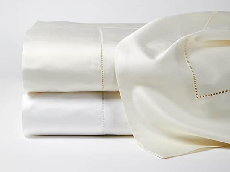
In finely considered bedding, the smallest details can carry the greatest distinction. A hemstitched edge, embroidery, piping, lace inset, or contrast border may be the element that gives a simple color its personality. These finishes are not merely decorative; they define the line of the bed and influence how formal or relaxed the arrangement feels.
Think about visibility as well as ornament. A border on a flat sheet may be most noticeable when the sheet is folded over the duvet or blanket. A decorative edge on a pillowcase frames the pillow and can create a more tailored effect. If the bed is usually styled with many layers, an elaborate finish may be partly concealed. If you prefer a pared-back arrangement, that same detail may become a focal point.
Finish also has a tactile dimension. A smooth, lustrous surface can lend a polished quality, while a matte or softly textured fabric may feel less formal. Product descriptions often use terms such as sateen, percale, embroidery, or hemstitch. Those words can help you compare, but they do not replace checking the item’s specific fabric, construction, and care details. Weave, fiber, weight, and finishing all contribute to the final hand and appearance.
For a reference point in evaluating detail, consider the Millesimo Flat Sheet, which is described as extra-long-staple cotton in a sateen finish with an Italian lace-inset border. Its example illustrates how a decorative edge can add definition to a smooth, luminous surface. It is a Sferra product, not a Bovi design; the useful comparison is in the way finish and fabric character can be assessed together.
Texture and construction are part of the design
The appearance of bedding is inseparable from the way its fabric handles light and folds. Sateen typically has a smooth face and a gentle sheen, giving color a more saturated or luminous quality. A matte finish may feel quieter and more relaxed. Heavier cloth can drape with a substantial presence; a lighter fabric may appear airier. These are tendencies, not guarantees, so read the specifications for the exact item rather than inferring its feel from a photograph.
Fiber content and construction matter for practical reasons, too. Look for clear information about materials, country of origin where stated, and recommended laundering. A beautiful finish is most satisfying when its care requirements fit your routine. If a sheet calls for specific washing temperatures, gentle cycles, or ironing to restore its appearance, decide whether that level of attention is realistic for your household.
Thread count is one specification shoppers often use as shorthand, but it should not be the only measure. Fiber quality, weave, finishing, and the overall construction all influence the experience of a fabric. A useful comparison considers these details together and avoids assuming that a single number tells the whole story. The best selection is the one whose feel, appearance, and maintenance align with how the bed will actually be used.
The Milos Flat Sheet offers another example of how product details can inform a decision: it is described as extra-long-staple cotton with a sateen weave, substantial hand, and a hemstitch finish. Again, this is a Sferra product rather than Bovi bedding. It can serve as a reference for comparing the language used to describe sheen, weight, and edge detail across bedding options.
Match the bedding to the room’s style
A bedroom’s style is rarely a single category, and it need not be. The aim is to create a conversation between the bedding and its surroundings. In a minimal room, a restrained palette and precise finishing can make a bed feel considered without adding clutter. In a traditional interior, a border or subtle pattern may complement established forms. In a more eclectic room, a confident color or print can connect otherwise varied objects.
For a calm, contemporary bedroom
Consider solid colors, fine lines, and controlled contrast. A crisp white or soft neutral ground can emphasize clean architecture, while a discreet border brings definition without disrupting the room’s simplicity. Texture can do much of the work: combine a smooth sheet with a more tactile coverlet or blanket, keeping the palette edited.
For a warm, layered interior
Look to undertones that complement timber, woven materials, and warmer metal finishes. Cream, muted earth tones, and softened colors can establish continuity. Patterns may be welcome, but choose them with attention to scale and the other textiles in the room. One expressive layer is often more persuasive than several competing statements.
For a classic or tailored room
Details such as a hemstitched edge, narrow piping, or a carefully placed border can reinforce a polished look. Keep the finish proportional to the bed and avoid making every layer equally ornate. Pair a decorative sheet or pillowcase with simpler surrounding pieces so the craft remains visible.
For a small bedroom
There is no rule that small rooms must be entirely white. Still, a coherent palette and fewer abrupt contrasts can make a compact space feel more composed. Use pattern thoughtfully, perhaps in a small repeat or a limited border, and consider how the bed’s broad surface relates to the room’s walls and floor. A bedspread or duvet in one dominant tone can create a sense of continuity.
Build a bed that feels finished, not overworked
Layering adds depth, but each additional textile should have a purpose. Begin with the sheets, then add the main cover, followed by a blanket or coverlet if the room and climate call for it. Decorative cushions can introduce a color or texture, but they need not multiply simply because there is space for them. A well-edited bed often looks more inviting than one crowded with accessories.
Vary texture rather than relying on contrast alone. A smooth sateen sheet can sit well beneath a matte quilt; a plain duvet can gain interest from a finely finished pillowcase. When the print or border is already prominent, let the other layers recede. This kind of restraint allows craftsmanship to register and keeps the room from feeling staged.
Also consider how the bed is used. A guest room may benefit from layers that are easy to arrange and care for. A primary bedroom might accommodate more considered styling, but comfort and routine remain central. Bedding is not a still-life composition: it should be appealing at bedtime, manageable in the morning, and suited to the people who use it.
A practical comparison checklist
When several designs seem equally appealing, compare them against the same set of questions. This keeps the decision grounded in more than a passing preference and helps distinguish a beautiful photograph from a suitable choice for your own room.
- Does the color work with the room’s fixed elements? Consider undertones, daylight, and nearby materials.
- What is the design’s visual scale? Decide whether the pattern will read as a subtle texture or a focal point.
- Where are the details placed? Check borders, hems, embroidery, and contrast edges in relation to how the bed is made.
- How does the fabric appear to handle light? Compare the described finish, weave, fiber, and weight rather than relying on color alone.
- Can the bedding coordinate with what you already own? Note which sheets, blankets, and cushions can remain in rotation.
- Are the care instructions practical? Review washing and drying guidance before committing.
- Is the item specified clearly? Confirm size, material, construction, finish, and any relevant dimensions with the current listing.
- Would you still like it without the styling around it? Imagine the item in your bedroom rather than only in a styled product image.
Shop with a point of view
Choosing Bovi bedding by design and detail is ultimately an exercise in editing. Start with the room’s palette, identify how much pattern it can comfortably hold, and decide whether you want the bed to make a statement or provide a quiet foundation. Then weigh the smaller considerations—border placement, fabric finish, tactile character, and care—against the way you live.
When comparing collections, consult current product descriptions for the precise materials, construction, dimensions, and care recommendations. If a color or finish is difficult to judge online, seek a fabric sample or confirm the retailer’s exchange and return terms when those options are available. These small checks are particularly useful when a detail is central to the design or when the bedding needs to coordinate closely with existing furnishings.
The most successful bedroom is not necessarily the most elaborate. It is one in which the colors feel at ease, the textures reward a closer look, and decorative details appear where they can be appreciated. A carefully chosen sheet, a considered border, or a pattern with just the right scale can change the bed’s character without asking the rest of the room to compete. Choose with that balance in mind, and the result can feel both polished and personal.
The final edit
Before deciding, picture the bedding in three moments: in daylight, turned down at night, and freshly made with the surrounding room in view. If its color, finish, and level of detail feel right in all three, you are likely looking at a choice that will belong—not just look beautiful on a product page.