Bedding details · Textile finishes
How Embroidery Shapes the Character of Bovi Linens
A line of stitching can change the mood of an entire bed. On fine linens, embroidery, borders, and other considered finishes bring pattern into the room with a light touch—or make the bed itself the main event.
When choosing Bovi linens, the appeal lies not only in color or fabric, but in how decorative details meet the eye and hand. Motif scale, placement, thread, and the edge of a finished piece all help determine whether a bedroom feels quietly tailored, softly romantic, or richly dressed. The most successful choice is not necessarily the most elaborate. It is the one that feels at home with the room around it.
The quiet authority of a finished edge
In a bedroom, the bed occupies a generous amount of visual space. That makes even a small detail unusually influential. A narrow stitched border can frame a pillowcase like a fine line on a drawing; a repeating embroidered motif can lend a duvet cover rhythm; a band of texture can give a plain sheet a more deliberate finish. These details do not simply decorate fabric. They help organize the way the eye reads it.
Embroidery is an especially expressive textile finish because it adds dimension to an otherwise flat surface. Thread sits on, or is worked through, the ground cloth, creating subtle relief and a play of light that printed pattern cannot quite replicate. From a distance, the effect may be read as a clean outline or a quiet field of texture. Up close, the stitch reveals its character: its density, direction, regularity, and relationship to the fabric beneath it.
That distinction matters in a room where softness is part of the design language. Bedding already introduces inviting texture through the weave of the cloth, the loft of a comforter, and the relaxed folds of a coverlet. Embroidery can complement those layers, adding definition without making the bed feel visually heavy. Its best expression often feels integrated rather than applied as an afterthought.
Embroidery, stitching, and trim: what is the difference?
The vocabulary of textile finishes can be easy to blur. Embroidery generally describes decorative stitching used to create a motif, line, or area of design. The stitched element may be tonal, so that it is noticed more by touch and shadow than by color, or it may contrast with the fabric for a more graphic impression.
Stitching can also be functional. Seams hold panels together, hems turn and secure raw edges, and reinforcement stitching helps a textile withstand regular use. Such construction may be beautifully executed, but it is not automatically decorative embroidery. Trim is another category: it can include an applied edging, piping, a woven band, or other material added along a seam or border. Each finish produces a different effect and may call for different care.
When reading a product description or examining a piece, it helps to name what is actually specified rather than assuming that every border is embroidered. A woven border, a line of stitching, and a raised embroidered motif may look related from across the room, yet their construction and tactile qualities differ. Clear descriptions help set useful expectations about appearance, hand, and maintenance.
Motif scale: the difference between a whisper and a statement
Scale is one of the first things to consider when comparing embroidered linens. Small motifs and fine linear details tend to read as texture. They leave plenty of open space, preserving the calm, expansive quality many people want from a bed. Such finishes are particularly effective in rooms that already have a patterned rug, expressive wallpaper, or a strong architectural feature. The linen contributes nuance without competing for attention.
Larger motifs announce themselves more clearly. A broad botanical design, a pronounced geometric repeat, or a bold band can turn the bed into a focal point. That can be striking in a restrained room, where the surrounding palette and furnishings give the pattern room to breathe. In a more layered interior, however, a large motif should be considered alongside nearby patterns and textures. A room can certainly mix designs, but it benefits from a sense of hierarchy: one pattern leads, while the others provide supporting notes.
Color changes the perceived scale, too. A pale motif against a pale ground can seem almost atmospheric, even when its shapes are relatively large. Strong contrast sharpens the edges and makes the same design feel more emphatic. Tonal embroidery offers an elegant middle ground: it gives the cloth dimension while keeping the overall impression composed.
A useful test is to view the pattern at two distances. Up close, notice the workmanship and tactile character. Then step back and consider the bed as a whole. Does the motif settle into the room, or does it immediately claim all the attention? Neither response is inherently wrong; the question is whether that is the effect you want.
Placement gives a pattern its point of view
Where decoration appears can matter as much as its design. A border around a pillowcase creates a framed, orderly impression. A motif placed near the edge of a duvet cover may be visible when the bed is turned down, while a design centered across the top can become the primary visual feature. Details running along a hem often feel more tailored because they emphasize the geometry of the textile.
Placement also affects how a bed looks when it is made. A carefully positioned border can make a folded top sheet appear crisp and intentional. On a bed with layered coverlets, quilts, and cushions, some embroidered sections may be partly concealed. Consider how the linens are likely to be arranged in everyday use: a design that looks lovely when fully spread may disappear under the layers you prefer.
Pillowcases are a useful place to introduce a more decorative finish without committing the entire bed to a strong pattern. Because they sit at eye level, even a restrained border can be noticed. Conversely, a simple pillow arrangement can provide a pause if the duvet or coverlet carries more elaborate detailing. The aim is not strict symmetry or a prescribed formula, but a pleasing distribution of visual weight.
Think of the bed as a composition rather than a collection of individual purchases. A motif on one piece might echo a line in a headboard, the geometry of a bedside table, or the edge of a curtain. The connection need not be literal. Repeating a color, shape, or degree of formality is often enough to make the room feel considered.
Texture begins with the cloth beneath the detail
Decorative stitching is only part of the sensory story. The ground fabric—the cloth into which a design is worked—sets the foundation for how the linen feels and how the finish behaves. A crisp, smooth surface gives stitching a clean backdrop; a more textured weave can make the same detail feel relaxed or rustic. The contrast between a flat ground and raised thread may be delicate or pronounced depending on the material and construction.
For that reason, it is worth considering fabric and finish together rather than treating them as separate decisions. Ask whether you prefer a cool, crisp hand or a softer, more relaxed one. Consider the season, your usual sleep environment, and how the bedding will be layered. A decorative feature can be beautiful, but comfort remains essential: bedding is something you live with, not merely a surface to admire from the doorway.
Details also influence the way light moves across the bed. Matte fabric tends to keep a quiet, understated appearance, while a more lustrous surface catches highlights. Raised stitching can cast fine shadows; a smooth border may read as a clean graphic line. In a softly lit bedroom, these differences create atmosphere without requiring a dramatic color scheme.
A considered example: the Bovi Magnolia Sheet Set
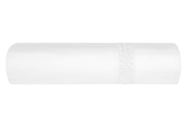
The Bovi Magnolia Sheet Set offers a useful example of how a finish can add distinction without overwhelming the underlying fabric. Its product description specifies 100% cotton percale, a 200 thread count, and a distinctive border pattern. It describes the look as clean and tailored, with a matte finish and three versatile colorways. Those details suggest an approach in which the border provides visual interest while the overall effect remains restrained.
It is important to be precise about what is described: the Magnolia set is presented as having a border pattern, not specifically as an embroidered design. That distinction illustrates why close attention to product language matters. A border can shape the character of bedding whether it is created through embroidery, weaving, stitching, or another construction; the description should guide expectations about the actual finish.
Percale is known for a crisp, breathable feel, making it a natural partner for a tailored aesthetic. Here, the combination of a matte surface and a defined border offers a composed alternative to a heavily ornamented bed. The finish can be treated as a quiet anchor: pair it with simple layers for a clean look, or introduce more texture through a coverlet and cushions while keeping the palette connected.
Building a bedroom around decorative linens
When a linen detail catches your attention, take a moment to look beyond the bed. Consider the room’s existing colors, surfaces, and patterns. A subtle stitched motif may reinforce a calm palette; a contrasting border can introduce a crisp line that relates to furniture or architectural trim. If the room already contains several strong elements, choosing a quieter finish can bring balance rather than adding another competing focal point.
Color coordination does not require matching every element. A soft, tonal scheme can feel polished, but a carefully chosen contrast often gives a room its personality. Look for relationships rather than identical shades: a warm neutral in the bedding might sit comfortably alongside darker wood, while a muted color could echo a detail in a rug or artwork. The texture and finish help bridge the colors, lending the arrangement a sense of continuity.
Layering is another way to modulate the effect. Let one decorated piece lead, then add plain or lightly textured layers around it. If the embroidery is intricate, uncomplicated sheets and a restrained coverlet can provide visual breathing room. If the linen is nearly plain, a patterned throw or a few cushions may supply the contrast. The overall impression should feel intentional, but not overworked.
It is also worth considering how the room changes during the day. Natural light can reveal fine stitching and tonal variations that are less visible in the evening. At night, bedside lighting may emphasize texture and shadow. A detail that seems almost invisible under one kind of light may become quietly beautiful under another. If possible, look at colors and finishes in the context of the room rather than relying on a small screen image alone.
The practical side of beautiful details
Care is part of the design decision. Before choosing decorative bedding, check the manufacturer’s instructions for laundering, drying, and ironing. Different fibers and finishes can have different needs, and the care label is more reliable than a general assumption about how a fabric should be treated. If a set is machine washable, follow its specified settings and avoid practices that could put unnecessary stress on the textile.
For embroidered pieces, it is sensible to look at the density and placement of the stitching. A fine, open motif may feel quite different from a densely worked area, particularly where the fabric meets the skin. Run your fingers gently over the surface when examining a sample, if available, and consider whether the texture suits your preferences for sleeping and making the bed.
Construction deserves attention, too. Look for neat hems, even seams, and a finish that appears secure. These details are less theatrical than a bold motif, but they contribute to how bedding performs over time. Decorative linens should be both pleasing and usable; a well-considered design respects everyday routines as much as it does appearance.
A simple checklist for comparing linens
When two sets seem equally appealing, a few deliberate questions can make the choice clearer. Use this checklist to assess the details in context:
- What is the finish? Distinguish embroidery from a woven pattern, piping, trim, or a simple seam.
- How prominent is the motif? Consider its size, contrast, density, and visibility from across the room.
- Where is it placed? Imagine how the design will appear when the bed is made and layered as you normally arrange it.
- How does it relate to the room? Look at existing patterns, colors, furniture, and architectural lines.
- What does the fabric feel like? Weave and hand shape comfort as much as they shape appearance.
- What care does it require? Read the product details and care instructions before deciding.
- Does the overall effect feel balanced? The best choice may be the one that adds character without asking every other element to compete.
The art of knowing when to stop
Decorative bedding can be an invitation to express a particular mood, but refinement often comes from editing. A single border, a graceful motif, or a thoughtful combination of cloth and color may be enough. When every layer carries a strong pattern, individual details can lose their clarity. Giving a distinctive finish room around it allows the workmanship—and the texture—to be appreciated.
This does not mean a bedroom must be spare. A richly layered interior can still feel harmonious when its elements share a point of view. Perhaps the palette is soft, the patterns are varied but similar in scale, or the materials repeat a sense of craft. The thread connecting them may be subtle, but it gives the room coherence.
Ultimately, embroidery and other textile finishes shape the character of Bovi linens by influencing how a bed reads: crisp or relaxed, understated or expressive, contemporary or classically tailored. Looking closely at motif scale, placement, construction, and fabric makes the decision more informed. The most compelling bedding is not simply decorative. It feels considered in the room, comfortable in daily life, and enduring enough to remain beautiful after the first impression has passed.
In brief
Start with the feel of the fabric, then consider how its finish contributes to the room. Fine, tonal details tend to read as quiet texture; larger or more contrasting motifs make a stronger statement. Placement determines what remains visible, while careful attention to product descriptions clarifies whether a border is embroidered, woven, or created another way. With those distinctions in mind, decorative linens become easier to choose—and easier to make your own.